It’s with pleasure that I officially announce UrbanDuniya’s makeover, skilfully crafted by Cez Krol of bloginstallations.com!
The beautiful new look, which some of you may have noticed earlier this week, better reflects the colours of the duniya and my passion for what I do. All pages now have a photographic backdrop based in scenes typical of that page’s content.
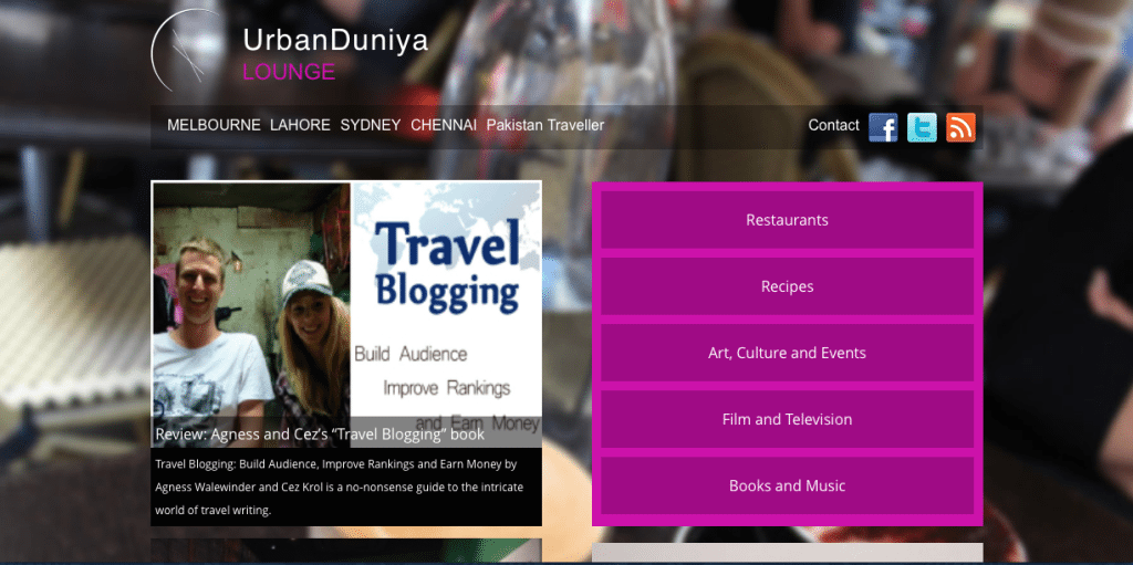
The new UrbanVoice, with its background of a cafe scene taken right here in Melbourne
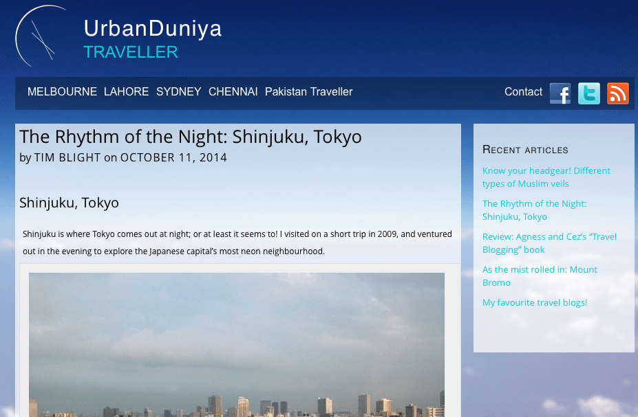
For example, UrbanVoice, our news and views section has a real image of the process of writing (while in Lahore, I might add!), with pages and pages of real content from the site. UrbanLounge is coloured with a classic cafe scene in Melbourne, UrbanTraveller depicts a real horizon viewed from 40,000 feet above India, and UrbanGallery has a sumptuous shot of Barcelona architecture. Walking amid the shallows on Fesdu Island in the Maldives, UrbanStory perfectly portrays the journey of UrbanDuniya.
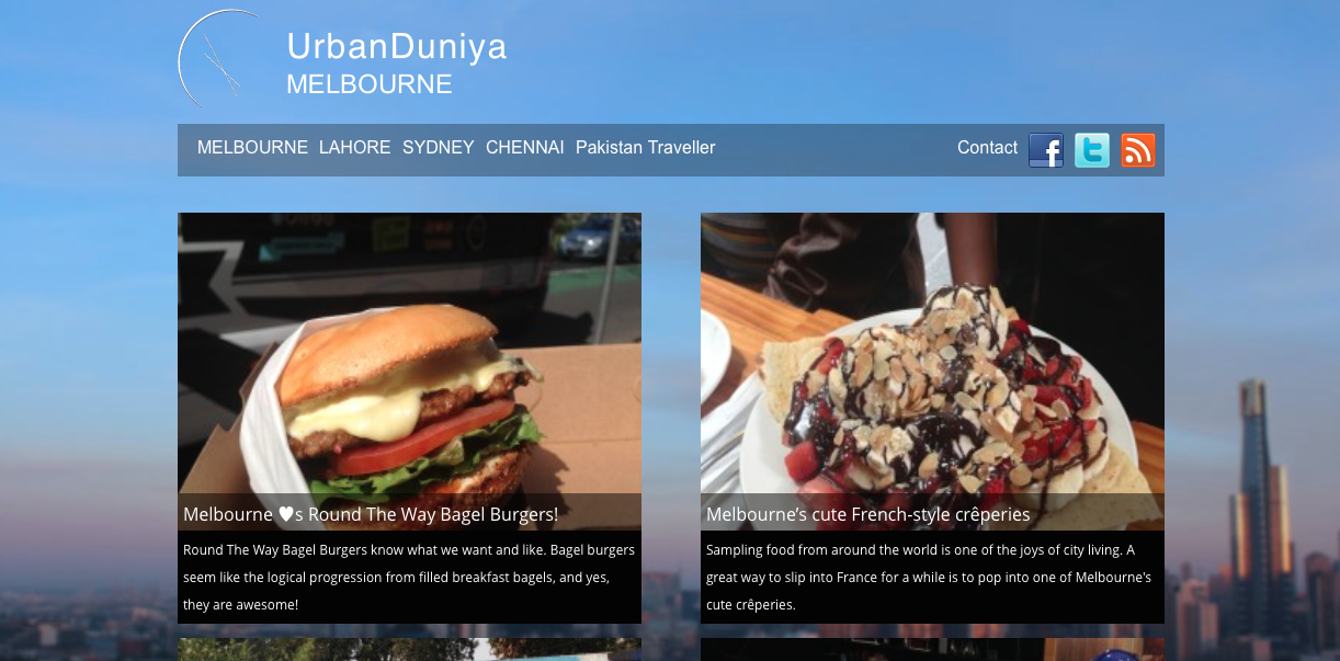
The new Melbourne city page
Of course, there is a greater emphasis on our beautiful cities; Melbourne, Lahore, Sydney and Chennai; with a new page each where all the news and information for each exciting metropolis comes together. All the content for your city is just one click away!
Pakistan Traveller by UrbanDuniya has also received a makeover, with an improved layout and more information on how to travel in this amazing country.
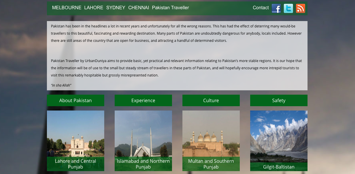
Pakistan Traveller’s new page
What hasn’t changed though is my commitment to what I do; real, useful and interesting information, stories, reviews, photography, and writing from four cities and around the world. I hope you like the new look as much as I do – please tell me your thoughts!

Love the new look 🙂 Very unique too, don’t think I’ve seen a blog with different backgrounds for each section before.
Thanks Catherine! I’m glad you like it! 😀
Hey Tim, awesome you have a new look blog, that’s very exciting, however…. I am unable to read the main content/writing on your blog, as it is too close to the black background color. I can read it if I highlight it. I did open your blog in a number of different browsers to ensure it wasn’t just something glitchy there.
Hope you had a great weekend my friend and have an even better week. Cheers, Anna
Hey Anna! Thanks for the feedback… I haven’t heard anything along those lines until now, but I’ll definitely look into it, and try to fix the issue – I don’t want anyone to miss out on my content!
Hope you’re going well – have an awesome week! 🙂