Airline tail art: Corporate creativity
Over the past few months I’ve been running a series of galleries highlighting the most interesting, creative and even beautiful airline tails from around the world. I’ve photographed tails with stylised flags, birds, animals, designs, national emblems and icons, each representing the airline’s home nation’s culture or pride.
Today I’m wrapping up the series with corporate logos. Airlines base their logos on a variety of inspiration; national colours, local culture or business image. Here’s the final instalment of airline tail art, with corporate creativity.
-
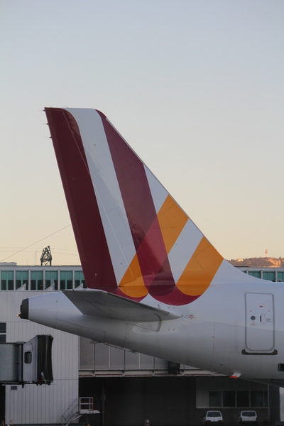
Cologne-based low-cost airline GermanWings features a "W" in the colours of the German flag
-
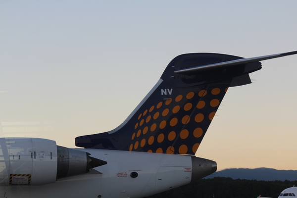
Dusseldorf-based Eurowings' old logo was a corporate network of navy and golden dots
-
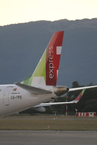
TAP, Portugal's national airline, features the letters "TAP" written on the tail in the national colours.
-
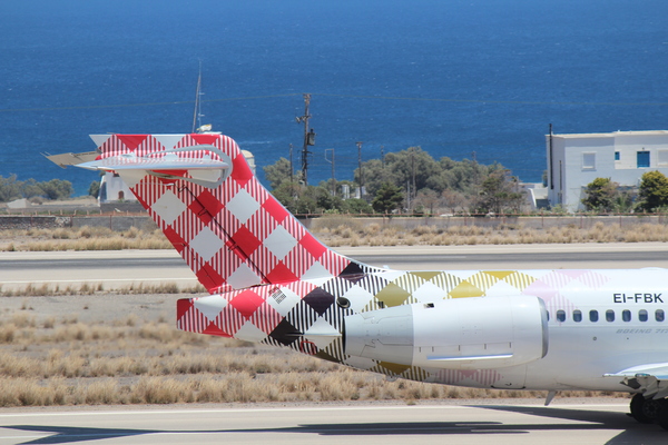
Volotea, a Barcelona-based low-cost airline, sports a red and yellow checkered tail
-
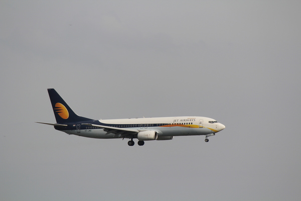
Jet Airways of India's corporate logo features jet trails across a setting sun
-
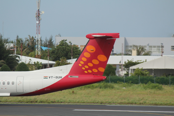
SpiceJet of India features a saffron spotted pattern
-
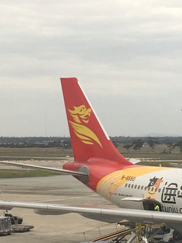
Beijing's Capital Airlines' dragon insignia
-
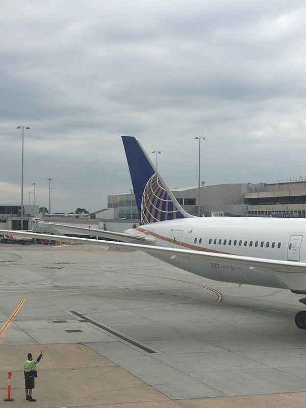
United Airlines, since merging with Continental, has retained the latter company's globe logo.

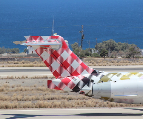

Volotea…. that’s rad! 🙂 I’ve been thinking I need to find a table cloth in that print too. It’s a sign.
I know, right? When I saw that, I almost tripped over myself trying to get my camera out. Great design!
And if you see a tea towel with the same print, pls let me know 🙂
the tartan one might be better suited to a Scottish Airline…. 😛
I assumed it WAS a Scottish airline at first – I had to google Volotea. An interesting choice for a Spanish airline…